UX Antipatterns: Hinting: instead of acting
07 Mar 2013 by Michael Boeke
I’m going to explore more mobile UI antipatterns, starting with what I call “hinting instead of acting”. This is when a UI hints at the proper action a user should have taken, rather than just doing what the user expects.

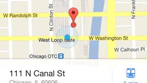
I love the Google Maps app on iOS (huzzah for public transit directions!), but it employed this antipattern when it launched. When you touched a pin on the map, it caused the bottom of the screen to bounce, hinting that you should swipe upwards to get directions and other options. Why not just open the panel when a user touches the pin?
I think Google was hoping to train users to swipe first, and borrowed the bouncing-bar trick from Apple. The iOS team got kudos for using this approach on the camera button of the unlock screen. However, it’s a really different use case, because you don’t want to make the camera too easy to trigger on the unlock screen, or you’d end up with a lot of pocket shots on the photo roll. It makes sense for iOS to require the more intensive swipe gesture, to make sure that the action is deliberate.
However, in the case of Google maps, the user is clearly interacting with the UI in an intentional manner. If enough users make the “mistake” of touching the pin that it warrants a hint, then Google maps should just accept the input request and give the user what they’re asking for. Clearly, the Google Maps app team agreed, and changed the behavior in a subsequent release. Iterative development FTW.
More about: design antipatterns mobile