UX Anti-patterns: mixing status and action
31 Jul 2012 by Michael Boeke
One of the things I’d like to explore on this blog are some of the common UI anti-patterns I see while designing software.
For example take a look at this picture from the very cool Jukebox 2 open source project. At a glance, it looks like most of the accounts are disabled.
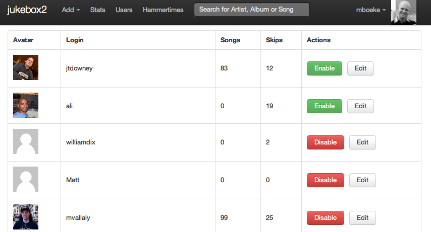
Surprise! The reverse is actually true. The problem is that the UI control for disabling an account seems to be displaying its state. This is totally confusing for the viewer, because it’s actually showing the state the account will be in once the users clicks the button.
I’m not trying to pick on the folks who contributed to Jukebox 2, as I’ve seen this same anti-pattern pop up on almost every project I’ve worked on that features tables with actions. The consequences for the user can be pretty drastic - in one instance when this anti-pattern was used for setting access permissions on a site with sensitive personal information, a user freaked out and locked everyone out of the site.
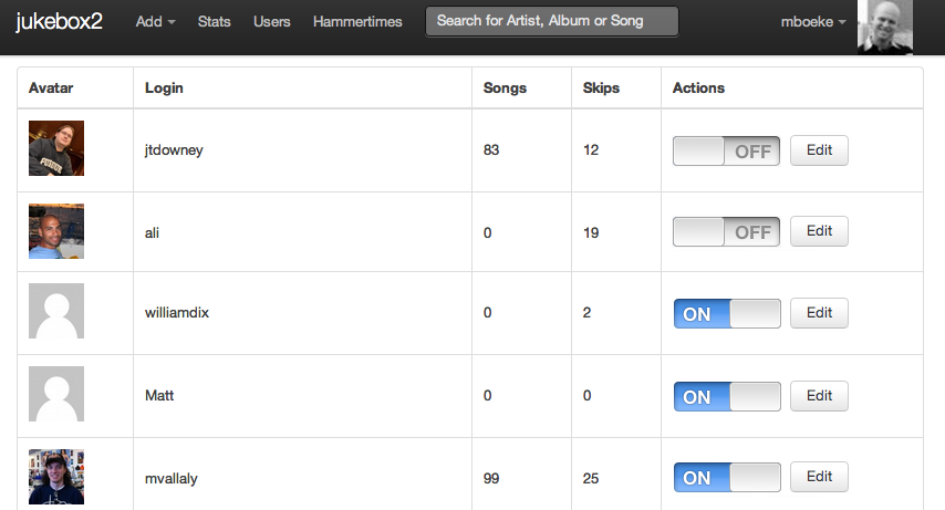
So what’s the better way to handle this? Much of the time, the action is a binary flag, so an On/Off switch is a natural metaphor. It can convey current state explicitly without the need to even display the action, since its implied by the very nature of the switch. The above example might look something like this:
That’s better, but we could help the viewer to better understand which users are enabled at a glance. In order to avoid confusion, we’ll use some styling on the row to signify a disabled user with gray text and a desaturated avatar photo.
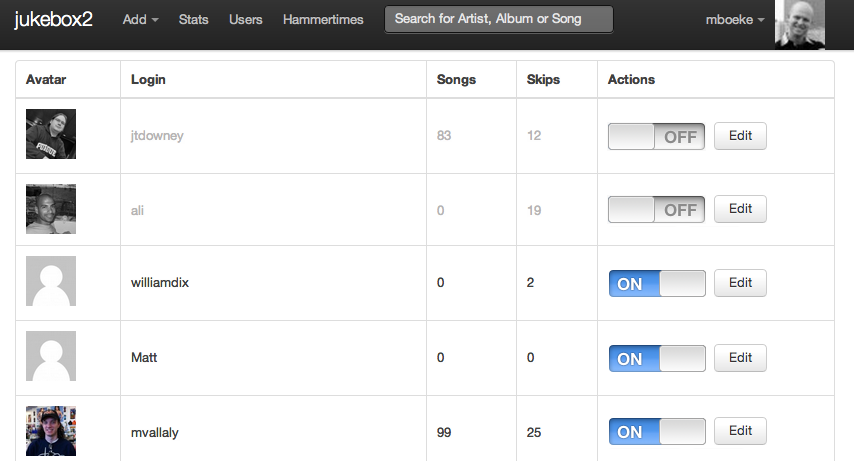
That’s a big improvement in usability, without a lot of development work. The next time you find yourself adding and “Actions” column to a table, do your users a favor and give this a try.
More about: design antipatterns